Click Here to Bid
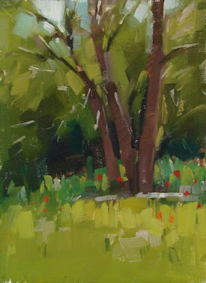
This is my last painting from the Jill Carver workshop. I loved this clump of trees, but the red poppies were actually from a spot nearby. I used my artistic liscense and moved them. : ) In my opinion the trick with editing is to only change what you can handle. If you're making up too much information that you don't have it tends to get funny - for me anyway.

10 comments:
This is really nice. I love the softness and the plain areas against the structured areas. Lots for the eye to enjoy. Bravo!
These keep getting better and better! I love this one, and your decision to move the poppies into the scene really livens it up. I've been doing that with my landscapes more often too, adding in things from memory or changing things around.
Well done! I also like the amount of small details you've put in as well as the bold strokes.
Great idea to add the poppies of reddy/orangey, gives the painting some pizazz/interest. Nice depth...
I really like this one, the different shades of green are nice, it's got great depth.
I'm really enjoying these outdoor painting of yours!
Another wonderful, freshh painting. You must have really enjoyed the workshop.
David Morris
"poppies, but those are trees..., oh yeah, there they are" lovely title, and great painting ;)
What a great finish to a workshop! It's been fun seeing the progression of paintings from beginning to end. I especially like Salado Creek, Life Among the Ruins and Poppies. I'm amazed at how your blocky brush strokes can convey an airiness and spontaneity. The variety of greens really creates the feeling of depth in each scene. After the workshop in Jacksonville I am really liking the quality of brush strokes I am getting just using flats rather than filberts. It keeps me from getting fussy and detailed. Thanks, Teach!!
You have brought your A game to your landscapes! Strong composition, vibrating color and brushwork. Beautiful.
I'd agree with you about the editing - taking out works for me, it's when I add too much I sometimes run into trouble! I love the color palette you use - no matter the subject your work is always distinguishable. Another beautiful piece!
Post a Comment